work
The Daily Aztec
The Daily Aztec
The Daily Aztec is a student-run newspaper that provides news to SDSU campus members, including over 40,000 students and at least 7,000 faculty and staff. My work includes creating graphics and uploading carousels on Instagram.
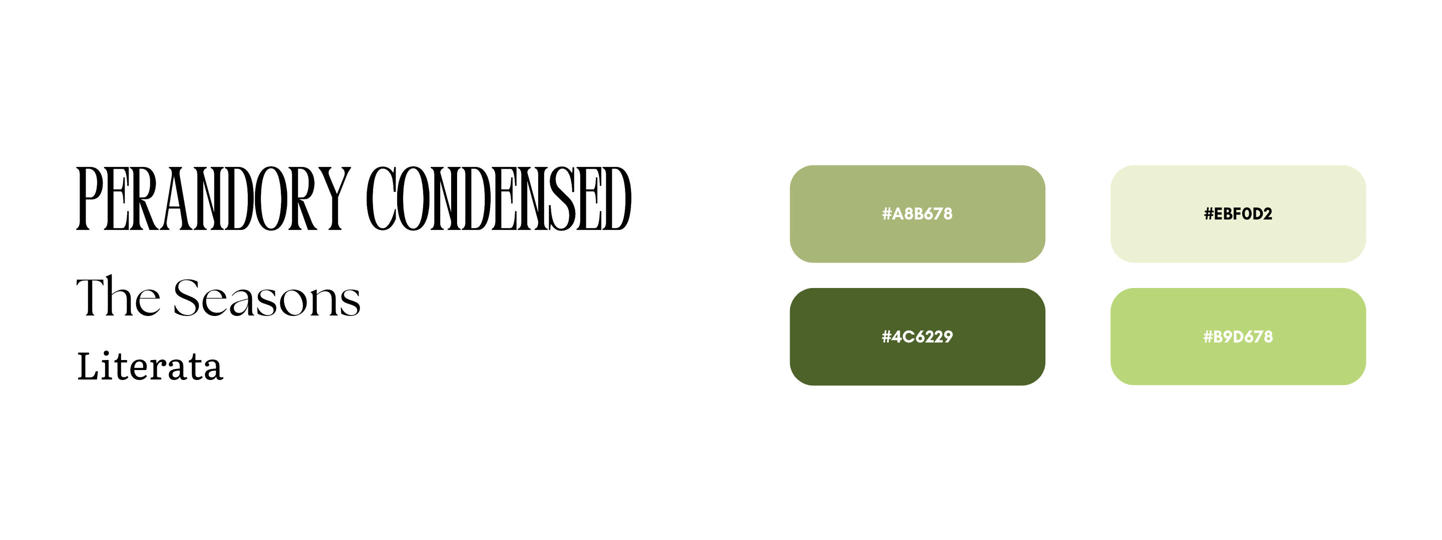
In the process of displaying the different matcha places in San Diego, various shades of greens were used to match the story's theme of matcha, along with doodle-like graphics scattered throughout the post to add to its playful, casual aesthetic.
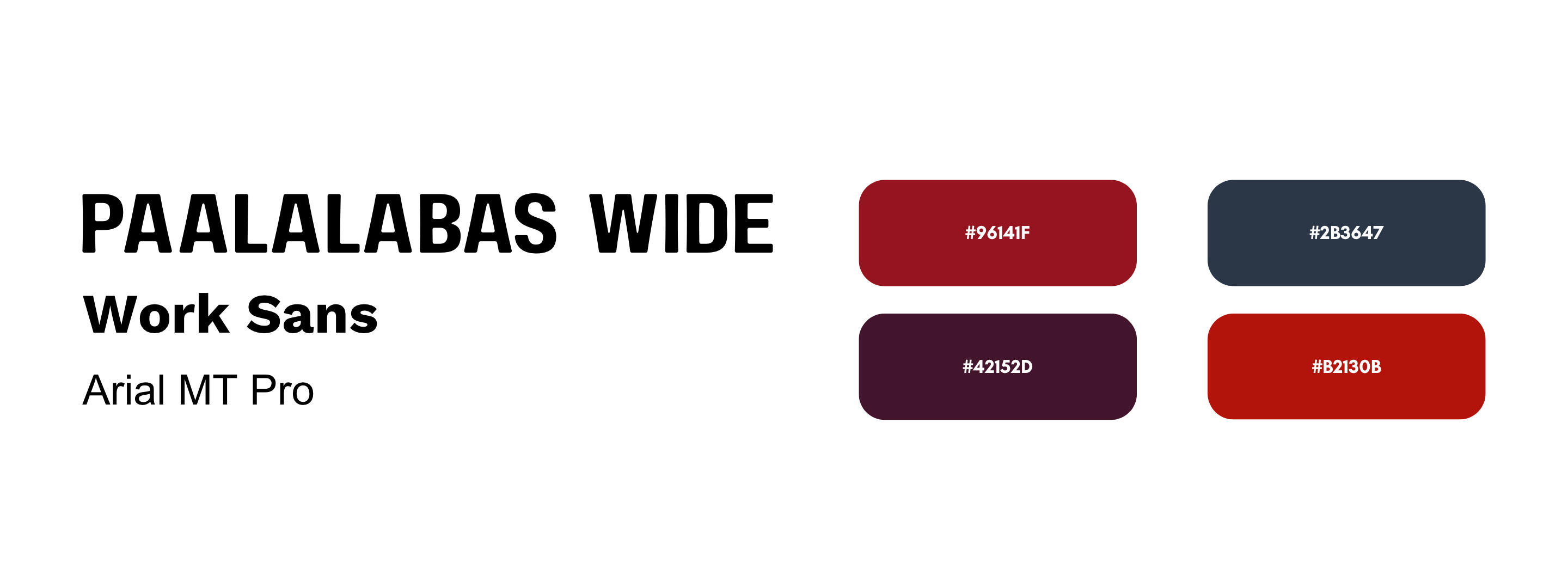
Centering around social media's impact on the social lives of college students, the cover was inspired by the usual formatting found on an average Instagram story. The rest of the post is designed to be similar to previous carousels that emphasize the article's photography.
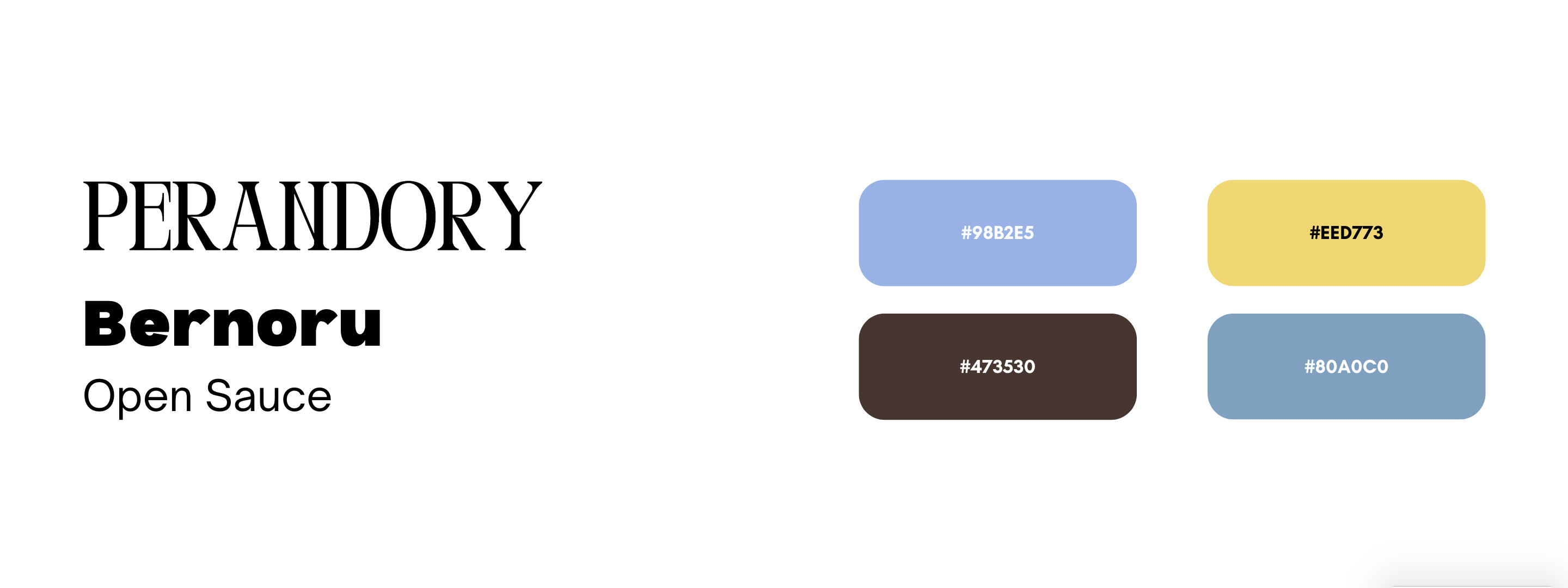
With an attention-grabbing display that catches the eye through its distinct sharpness, it juxtaposes the sans serif typefaces that follow, which creates a modern yet playful feel that align with the blitheness of the subject. Along with the images is simplistic line art that complements the minimalist aesthetic.
ITLogic
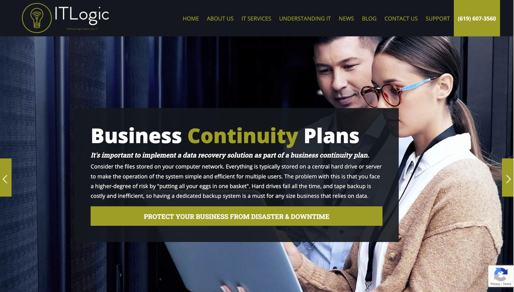
ITLogic is a managed and professional IT services company that provides services and consulting for small to medium-sized businesses. My work included redesigning their website to give it a more modern look.
website design
before
after!

process
Before starting, I conducted a survey, asking several questions including how was their experience navigating the website, what did they like or dislike about the visuals, and any sort of feedback outside of those questions.In these responses, there was an emphasis on the aesthetics, with people stating that the colors were too dark. The unanimous answer to my follow-up question of what colors do they prefer to see was blue, so I used a darker blue as part of my color palette to complement with white in order to make the website brighter. Another issue commonly pointed out was that the pictures were unappealing and clashed with the website's colors and texts. To address this, I used blue images and flat icons to add to the website's visuals while maintaining consistency in the colors.
Brochure
GALLERY

Website




a timeline of my journey . . .
When I was 14, I exposed myself to the creative space using Adobe After Effects to create video edits of my interests. I would upload them across Instagram, TikTok, X (formerly Twitter), and YouTube, and although I restarted my account since 2023, I have amounted to:
300+
edits in total
1000+
followers across all platforms
analytics of some of my edits on these various platforms:
Towards the latter end of my high school career, I took Graphic Design courses and further developed a passion for the subject. Since then, I have expanded my experience using Adobe software, including InDesign, Illustrator, and Photoshop. In doing so, I explored creating digital art for various purposes through these diverse mediums, ranging from magazines to shoes designs and even billboards.During this time, I also became involved in my school's journalism team. When I became an editor for our newspaper, I mentored at least 35 students to strengthen their writing, ultimately editing over 80 articles to be concise. Outside of those tasks, I developed ads using Canva to promote sales and collaborated with the other editors on my team to construct the newspaper using InDesign.
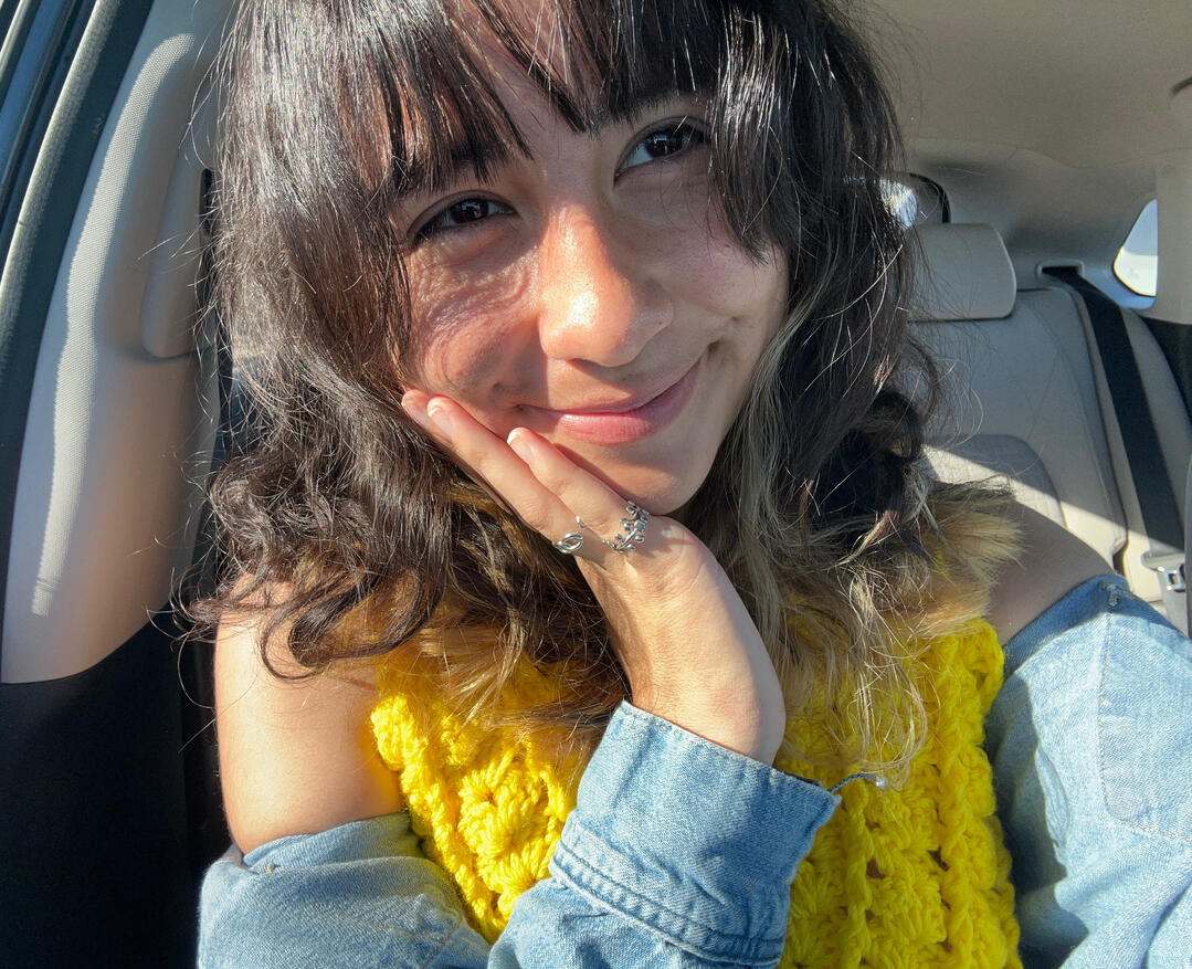
I am a 20 year old student who has a passion for expression through art and connecting with others. My goal in marketing is to build authentic and human relationships with consumers and to work together towards a common goal.
philosophy
• Incorporating fun and joy into all aspects of our lives is an underrated priority.
It is easy to get caught up in "hustle" culture, where our values get lost in this never-ending, glorified rat race to achieve an image or status that will never truly satisfy us deep down. First and foremost, we are human, and I believe our purpose is more nuanced than the constant grind.
• Interdependence should be the standard, not independence.
No single human being exists as a sole island in this world. As a society, we are interconnected, meaning we all bring something to the table, and beauty comes from the communal efforts to support one another. We are stronger together.
• It is important for us to go outside of our comfort zone, but it needs to be done with a purpose that speaks to a bigger goal in mind.
It is destructive to pointlessly suffer for the sake of it, but being intentional about the steps we take to embrace discomfort, whether it is to help ourselves in the present or in the future, is a key to nurturing our growth.

ITLogic
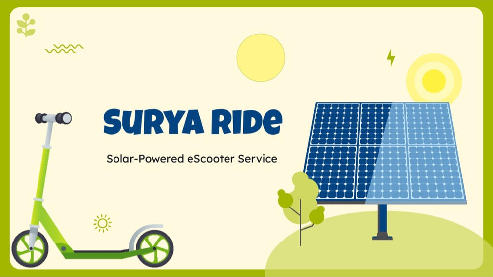
![SuryaRide]()
SuryaRide
a timeline of my journey . . .
In 2019, I exposed myself to the creative space using Adobe After Effects to create video edits of my interests. I would upload them across Instagram, TikTok, X (formerly Twitter), and YouTube.
Towards the latter end of my high school career, I took Graphic Design courses and further developed a passion for the subject. Since then, I have expanded my experience using Adobe software, including InDesign, Illustrator, and Photoshop. In doing so, I explored creating digital art for various purposes through these diverse mediums, ranging from billboards to magazines.
During this time, I also became involved in my school's journalism team. When I became an editor for our newspaper, I mentored at least 35 students to strengthen their writing, ultimately editing over 80 articles to be concise and to properly convey their message. Outside of those tasks, I developed ads using Canva to promote sales and collaborated with the other editors on my team to construct the newspaper using InDesign.
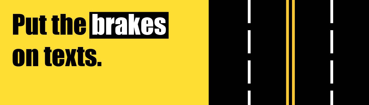
Billboard designs advocating for drivers to stop texting while driving. These were submitted to Project Yellow Light, a scholar competition bringing awareness about the dangers of distracted driving.
Program: Adobe Illustrator
A mock magazine with a cover and spread about how three women befriended each other when crossing paths while traveling.
Program: Adobe InDesign, Adobe Photoshop
I am a 21 year old who has a passion for expression through art and storytelling and connecting with others. My goal in marketing is to build meaningful relationships and to incorporate authenticity and compassion into our world.